Plugins
Intro To Plugins
Plugins for Builder help you integrate a third-party service and customize nearly every part of Builder's Visual Editor and models.
Plugins are a powerful tool for customizing the Visual Editor to make it easier for users to manage and create content.
Plugins help you:
- Create Custom types
- Extend the Visual Editor's user interface.
Types of Plugin
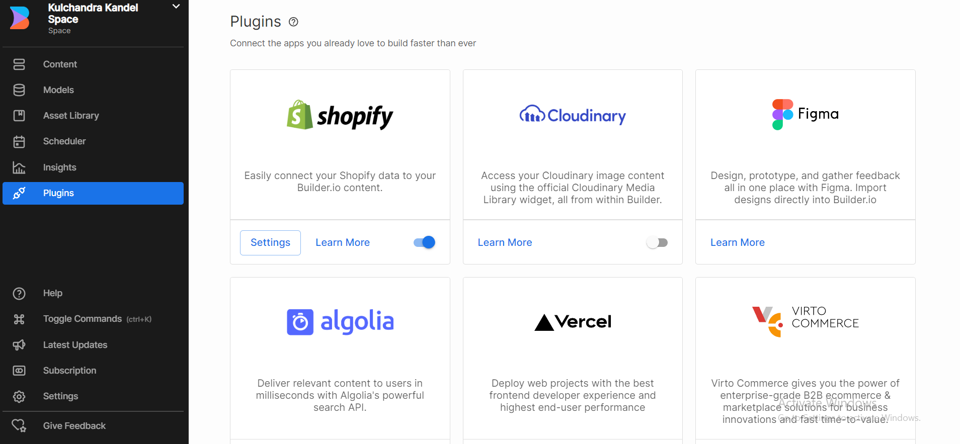
- Built in Plugins: On the Integrations page in Builder, use these ready-made plugins to help you integrate with e-commerce platforms and external data providers with minimal configuration. All plans can use the built-in plugins.
Use Cases
Use built-in plugins for integrating your Builder account space with e-commerce platforms and external data providers.Built-in plugins include everything in Integrations, such as:
- BigCommerce
- Commercetools
- Commerce.js
- Figma
- Partytown + Shopify
- Phrase
- Smartling
Setup
With Builder's built-in plugins, you can integrate a third-party app or service with minimal configuration. For context on this topic, see Intro to Built-in Plugins.To set up a built-in plugin in Builder:
- Go to Integrations.
- Click on the Enable button of the integration you'd like to use.
- When Builder completes the enabling process, click the Configure button in the notification that displays at the bottom of the screen. If you miss the notification, click the Settings button on the integration tile.
- Provide any API keys and tokens and click the Connect button.
Depending on the third-party platform, you might need to configure developer/API access on your platform and set the correct permissions.
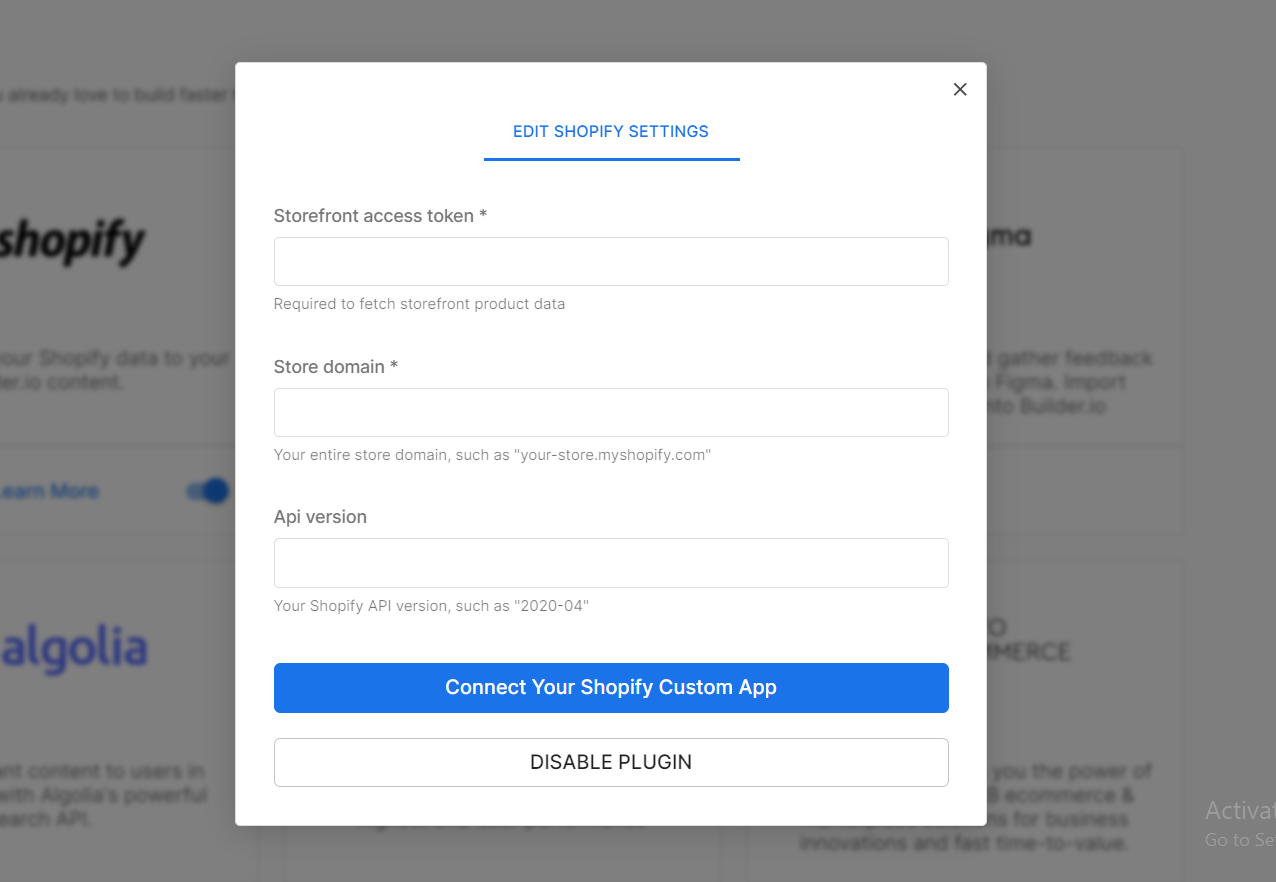
The exact steps and requirements for configuring e-commerce platforms vary from platform to platform. Refer to your platform's documentation for more information on how to acquire the API keys or tokens required by your plugin.
let's try using some built-in plugins
- Alogolia
installation -
- Go to Account Organization
- go to edit plugins and add (@builder.io/plugin-algolia)
- After adding the plugin the page will reload asking you to enter algoila credentials.
You'll need to create algolia Api key and ensure it has all the ACL permissions, most importantly
addObject,deleteObjectandsearch.
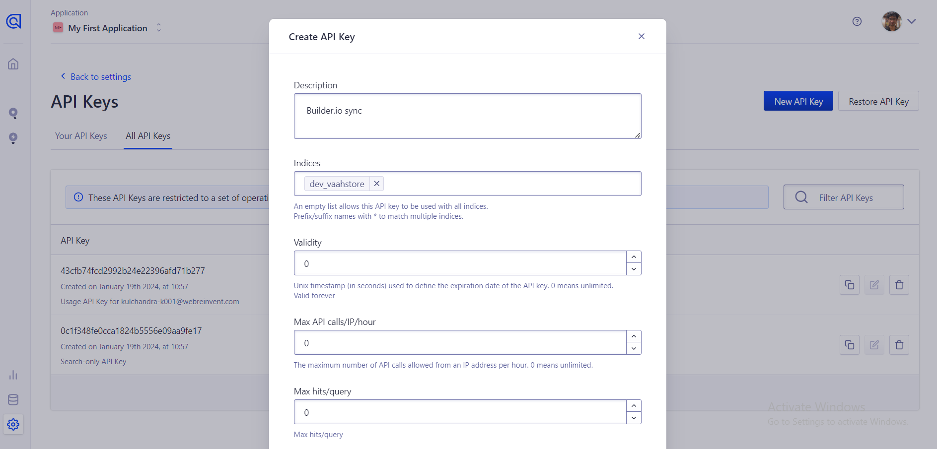
add the credentials in builder.io
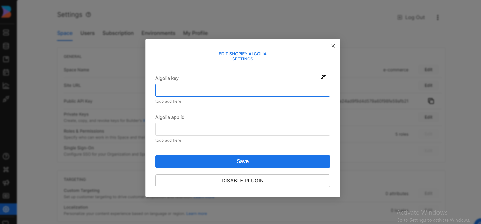
Syncing Model Data
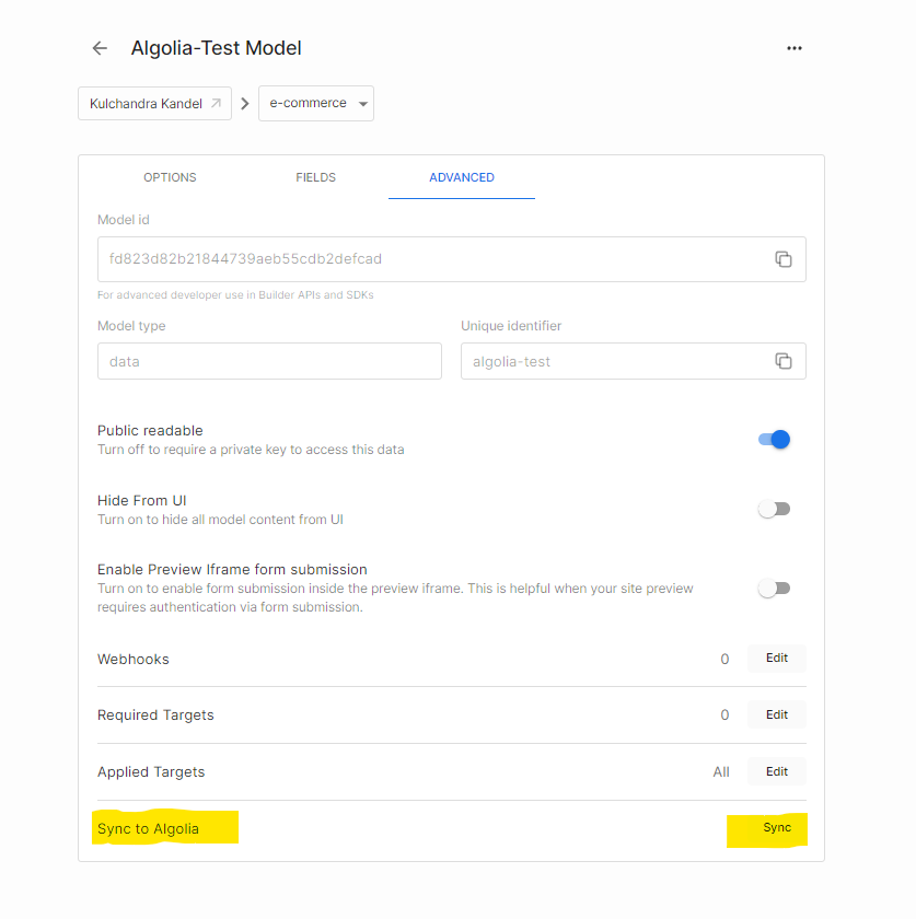
- Now that you have the plugin set up, you can start syncing your model content. First, head over to the Builder Model that you want to sync.
- Go to Advance tab and at the bottom you would see sync with Algolia
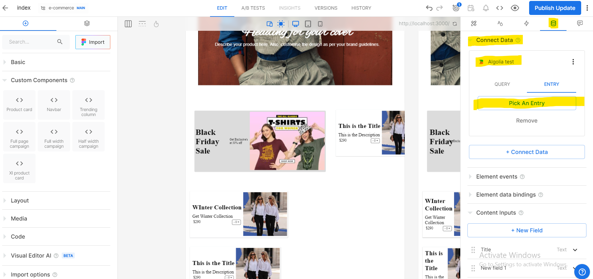
- Now on you content page you can connect with algolia data and features
- Public plugins: You code these and then submit a PR to add to the built-in integrations. Public plugins become part of the Builder ecosystem and when they're merged, Builder.io's engineers help maintain them. All plans can submit public plugins.
Use Cases
Use public plugins when you want to customize the Builder Visual Editor UI and you are willing to share your plugin with others. Common use cases for public plugins are:- Adding your own custom types for a model, such as a rich text editor
- Customizing the Builder Visual Editor
- Targeting content based on what users have in their cart
- Customizing Symbol inputs
- Creating an action plugin to trigger events in Google Analytics
- Adding an image management plugin
- Integrating with Shopify
Setup
Types of Builder Plugins
Plugin contributions tend to fall into three categories that cover the most common use cases:
- Custom editor plugins
- Data connector plugins
- Action shortcut plugins
More About Custom Editor Plugins
Customer editor plugins are the main use case for creating your own plugins. Almost all of the integrations in Builder use custom editors, which incudes most of the built-in e-commerce plugins.For example, with this type of plugin, teammates can search and link selected products and categories from their backend to structured data entries, Sections, and Pages within the Visual Editor with a minimal process.
Using custom editor plugins, marketing or design teammates can populate elements such as product cards, product galleries, add to cart buttons, and lists of product recommendations by selecting what they need from your plugin.
For a pre-made example, check out Builder's example action plugin.
More About Data Connector Plugins
Use data connector plugins to enrich the data available in Visual Editor Sections and Pages from external sources. With a data plugin, team mates can select entries or query the source and bind to the results of queries directly in Builder.
Builder also offers a data plugin utility library to help you in creating your data plugin.
More About Action shortcut Plugins
You can use action shortcuts in Builder to give non-technical teammates access to some of the tasks that would otherwise require developer involvement. With action shortcuts a user can trigger tracking events, set up conditional values, or set specific values on state without having to write code.
In the example illustrations that follow, the action Track Event with Google Analytics comes from a plugin that defines what this action does for the bound element. In this example, when the user clicks a button, the action sends the event addToCart to Google Analytics.
For a pre-made example, check out Builder's example action plugin.
- Private plugins: You code these but they do not become part of the Builder ecosystem because you maintain them privately. Private plugins are available on all Enterprise plans while plugins with your own branding are available as an add-on for Enterprise customers.
Use cases
Create private plugins when you have needs specific to your company that you need to keep accessible only within your organization. Examples include
- Customizing the look and feel of Builder with your own branding
- Adding custom flows for creating e-mail campaigns
Making your own Plugin
You can extend and customize Builder by making your own plugin. With custom plugins you can register custom field types for your Builder model custom fields and inputs for your custom components, custom targeting or symbols.
Lets create a basic plugin with a custom type and custom type editor. By creating custom types in a plugin, you provide rich data types that you can use across the Visual Editor. For example, you can:
- Create custom component inputs that accept structured data fields
- Target content based on products in a customer's cart
- Model fields that store multimedia content
- Enable Symbol inputs to accept externally hosted documents
Each custom type has a custom type editor, which provides a user interface for selecting values for your custom type fields. For example, editors can fetch external resources and present the user with a browsable list of items or provide menus and fields for data entry.
With custom types and custom type editors, your users can create and update nearly any kind of data structure beyond the basic types provided by Builder, all from within the Visual Editor.
After installing the plugin that registers your custom type editor, the corresponding custom type is available across the Visual Editor, specifically when using the following features:
- Custom component inputs
- Targeting content
- Model fields
- Symbol inputs
Step 1
Create a directory for your plugin and open the new director with the following command
mkdir custom-plugin && cd custom-plugin
Initialize Project to use npm package manager
npm init
Press Enter through the prompts and respond yes to the proposed package.json
Use npm install to install the dependencies for this project. You can use --save-dev because Builder provides these dependencies for you later. The dependencies are:
- @builder.io/app-context : exposes certain APIs to interact with APIs to interact with Builder
- @builder.io/react : enables you to use React to create your plugin
- webpack : module bundler for JavaScript
- webpack-dev-server : development server with live reloading
- @babel/preset-react : supports JSX
- babel-loader : transpiles modern and superset JavaScript, such as JSX using Babel with webpack
Paste the following command in command line which includes all the dependencies
npm install --save-dev @builder.io/app-context @builder.io/react webpack webpack-dev-server webpack-cli @babel/preset-react babel-loader
Install react-quill for the Rich Text editor that this plugin uses:
npm i react-quill
Step 2 Setting up the files
Now let's create the project infrastructure by creating the key files and pasting in the contents for each.
Replace the contents of package.json with the following:
{
  "name": "rich-text-plugin",
  "version": "1.0.0",
  "description": "",
  "entry": "plugin",
  "output": "plugin.system.js",
  "main": "dist/plugin.system.js",
  "files": [
    "dist"
  ],
  "scripts": {
    "build": "webpack --mode production",
    "start": "webpack-dev-server --mode development"
  },
  "author": "",
  "license": "ISC",
  "devDependencies": {
    "@babel/preset-react": "^7.18.6",
    "@builder.io/app-context": "^1.0.0",
    "@builder.io/react": "^2.0.13",
    "@emotion/core": "^11.0.0",
    "babel-loader": "^8.2.5",
    "webpack": "^5.74.0",
    "webpack-cli": "^4.10.0",
    "webpack-dev-server": "^4.10.0"
  },
  "dependencies": {
    "react-quill": "^2.0.0"
  }
}
At the root of your project, create a file called .babelrc and paste in the following:
// contents of .babelrc
// use preset-react to support JSX
{
    "presets": ["@babel/preset-react"],
    "env": {
      "development": {
        "presets": [["@babel/preset-react", { "development": true }]]
      }
    }
  }
Again at the root of your project, create a file called webpack.config.js and paste in the following:
// contents of webpack.config.js
const path = require('path');
const pkg = require('./package.json');

module.exports = {
  entry: `./src/${pkg.entry}.jsx`,
  externals: {
    '@builder.io/react': '@builder.io/react',
    '@builder.io/app-context': '@builder.io/app-context',
    "@emotion/core": "@emotion/core",
    "react": "react",
    "react-dom": "react-dom"
  },
  output: {
    filename: pkg.output,
    path: path.resolve(__dirname, 'dist'),
    libraryTarget: 'system',
  },
  resolve: {
    extensions: ['.js', '.jsx'],
  },
  module: {
    rules: [
        {
            test: /\.(jsx)$/,
            exclude: /node_modules/,
            use: [
              {
                loader: 'babel-loader',
              },
            ],
          },
        ],
  },
  devServer: {
    port: 1268,
    static: {
       directory: path.join(__dirname, './dist'),
     },
    headers: {
      'Access-Control-Allow-Private-Network': 'true',
      'Access-Control-Allow-Origin': '*',
    },
  },
};
This file establishes these key configurations:
- The location of the entry point, or where webpack starts when bundling. Here, it's plugin.jsx.
- The externals are dependencies that you don't need to bundle. You don't need to bundle them because when your plugin is ready, Builder provides these dependencies for you.
- resolve.extensions specifies that you're using JavaScript and JSX files. If you're using other file extensions, add them here.
- The module settings specify that you're using JSX files, not bundling node_modules, and using babel-loader to work with JSX.
- With devServer, configures your plugin to run locally on localhost:1268, serve from the ./dist directory, and provides headers for local development with Builder.
Step 3 Creating Plugin
Create a folder called src with a file called myPlugin.jsx and paste in the following:
// contents of myPlugin.jsx
/** @jsx jsx */
import { jsx } from '@emotion/core';
import { Builder } from '@builder.io/react';
import ReactQuill from 'react-quill';

function RichTextEditor(props) {
  return (
    <ReactQuill
      value={props.value}
      onChange={props.onChange}
    />
  );
}

Builder.registerEditor({
    name: 'MyText',
    component: RichTextEditor
});
The key points in the example above are:
- The editor component wraps ReactQuill, which in turn takes onChange and value as props. The value you set can be any type serializable to JSON, such as string, number, null, array, or object, and be as deeply nested as you need. Refer to the react-quill documentation for more information.
- props.onChange and props.value are passed to the editor component, which controls the editor's state. value is the current value of the field. onChange is a callback function that accepts one parameter, which is the field's new value after the user changes that value within the editor. For more information, see Controlled Components in the React documentation.
- When the user updates the text area provided by ReactQuill, ReactQuill calls onChange, which updates the editor's state.
- Updating the editor's state updates props.value, which is passed down to ReactQuill to update that component's internal state.
- Registering the editor component with Builder.registerEditor() creates the MyText custom type.
Builder.registerEditor() accepts one parameter: an options object with three properties:
- name: a string, typically camel-cased, that represents the custom type's name
- component: the editor component
- options (optional): an object
Step 4 Adding Your Plugin in Builder
Public Plugin : You code these and then submit a PR to add to the built-in integrations. Public plugins become part of the Builder ecosystem and when they're merged, Builder.io's engineers help maintain them. All plans can submit public plugins.
Private Plugin :
- Go to Account Settings.
- Click the pencil icon for Plugins to add the plugin.
- Enter the local address for this example plugin: http://localhost:1268/plugin.system.js.
- Click the Save button.
Step 5 Use Your Plugin in Builder
- Go to Models.
- Select a model to edit or create a new one.
- In the model, click the + New Field button.
- To confirm that your plugin is working, click the Type dropdown and scroll down to select the type *MyText. Notice that when you select MyText, the Default value input changes to a Rich Text input that includes text formatting options.
MyText comes from the name you provided in plugin.jsx. to Builder.registerEditor().
For help on creating your e-commerce plugin, Builder offers an e-commerce plugin utility library.
Extending Builder UI with Plugins
You can create plugins to customize Builder and the Visual Editor to meet your team's needs. This document covers the
areas you can customize with Builder.register(
- appTab : the left sidebar of the Builder UI
- editor.mainTab : top bar of the Visual Editor
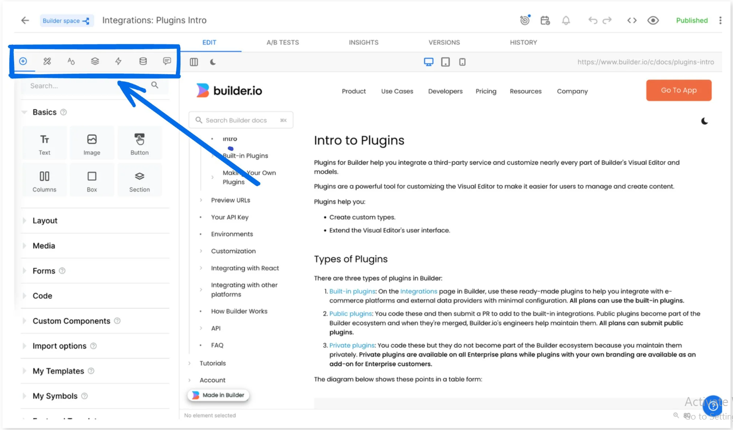
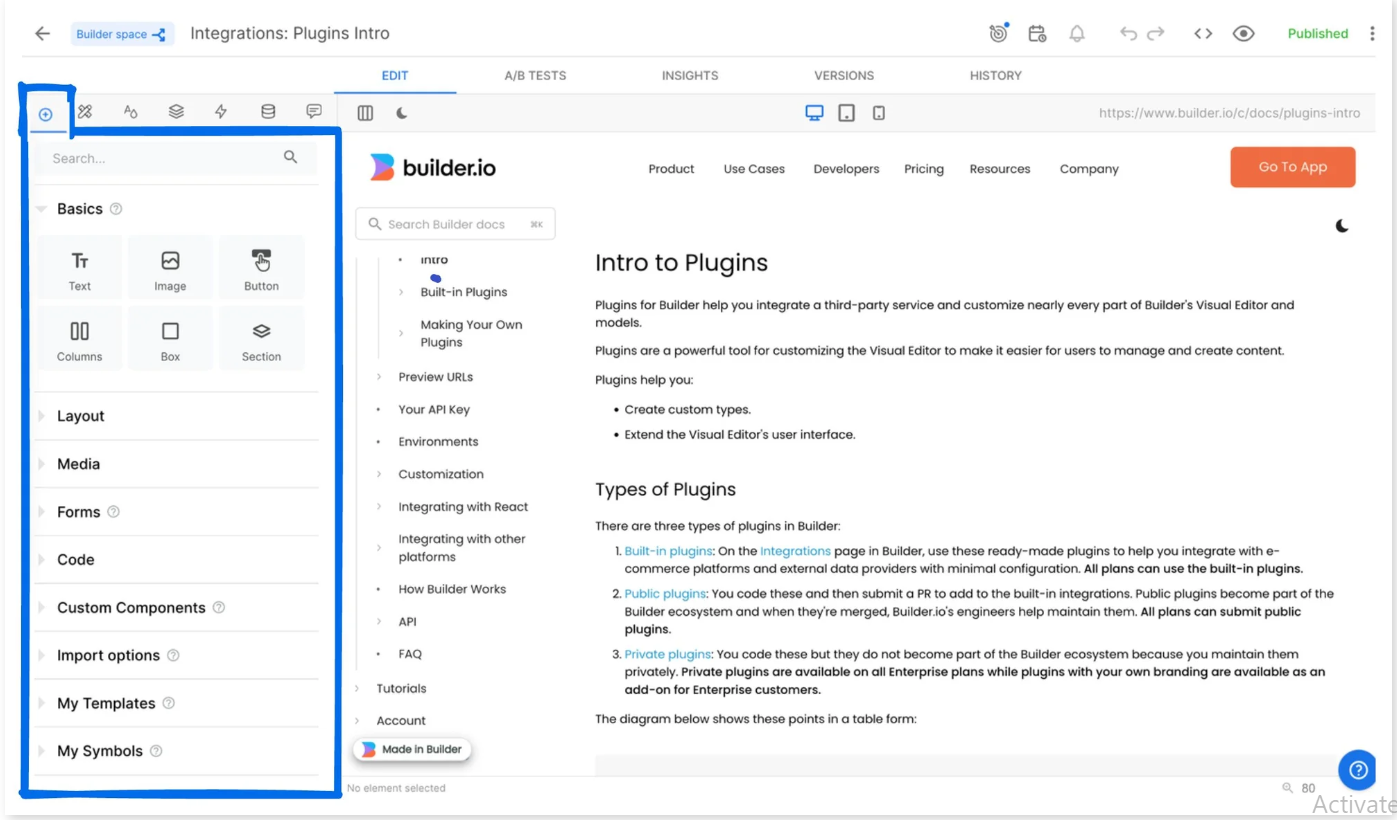
- editor.editTab : the panel of the UI that contains the Insert, Options, Style, Layers, Animate, and Data tabs.
- editor.insertMenu : the Insert tab
- editor.toolbarButton : the topmost section of the Visual Editor that displays features such as the icons for targeting, scheduling, alerts, code, preview, and the Publish button.
Table of Plugin Options you can customize
- appTab
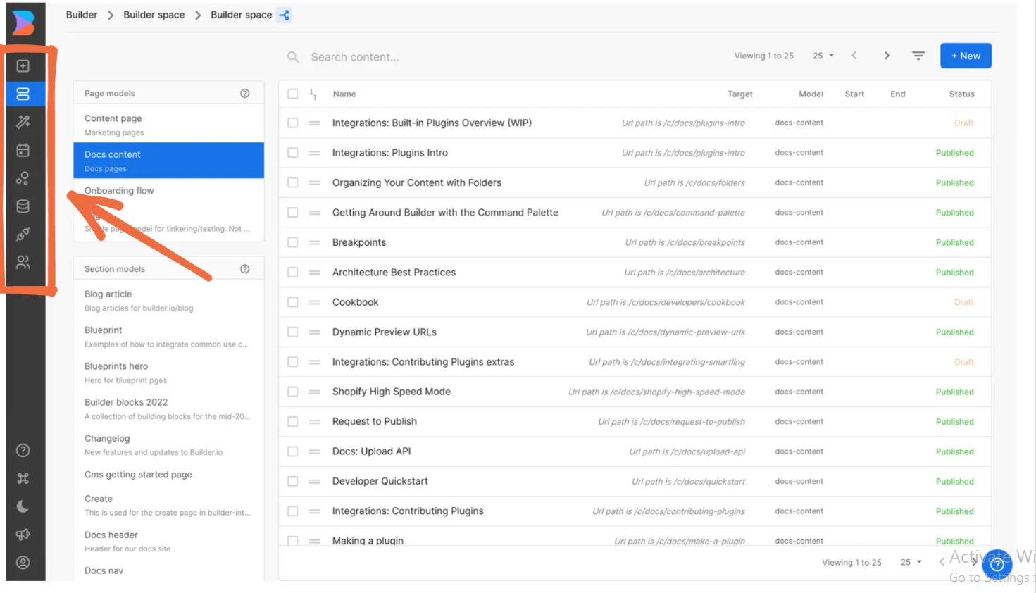
import { Builder } from '@builder.io/react';

function CalendarView(props) {
return <>{/* Read content and display on a calendar */}</>;
}

Builder.register('appTab', {
name: 'Calendar',
path: 'calendar',
icon:  'https:/...',
component: CalendarView,
})
- mainTab
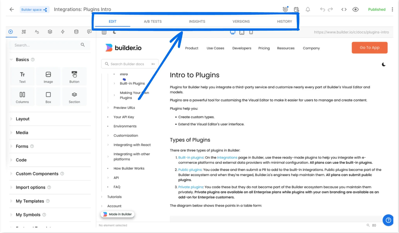
import { Builder } from '@builder.io/react';
import { useObserver } from 'mobx-react'
const context = require('@builder.io/app-context').default;

function NotesTab(props) {
  const { data } = context.designerState.editingContentModel;
  return useObserver(() =>
    <textarea
      value={data.get('notes')}
      onChange={e => data.set('notes', e.target.value)} />
  );
}

Builder.register('editor.mainTab', {
  name: 'Notes',
  component: NotesTab,
})
- editTab
import { Builder } from '@builder.io/react';
import { useObserver } from 'mobx-react'
const context = require('@builder.io/app-context').default;

function TailwindTab(props) {
  const { selection } = context.designerState;
  return useObserver(() =>
    <input title="color" type="number" onChange={e => {
      selection.forEach(el => {
        let value = e.target.value;
        el.properties.set('class', `text-gray-${value}`)
      })
     } />
  );
}

Builder.register('editor.editTab', {
  name: 'Tailwind',
  component: TailwindTab,
})
- insertMenu
import { Builder } from '@builder.io/react';
const { designerState } = require('@builder.io/app-context').default;

function InsertTab(props) {
  return <>
    <div
      onClick={() =>
        designerState.draggingInItem = 'Custom component 1'
      } />
    <div
      onClick={() =>
        designerState.draggingInItem = 'Custom component 2'
      } />
  </>
}

Builder.register('editor.insertMenu', {
  component: InsertTab,
})
- toolbarButton

import { Builder } from '@builder.io/react';
const { designerState } = require('@builder.io/app-context').default;

function WorkflowButton(props) {
  return <div onClick={launchApprovalModal}>
     Pending approval
  </div>
}

Builder.register('editor.toolbarButton', {
  component: WorkflowButton,
})
!TIP For an example plugin with multiple options, check out Builder's campaign plugin example
Editor Setting
import { Builder } from '@builder.io/sdk'

Builder.register('editor.settings', {
  hideStyleTab: false,      // Hide the style tab
  hideMainTabs: false,      // Hide all main tabs
  hideDataTab: false ,      // Hide the data tab
  hideOptionsTab: false,    // Hide the options tab
  hideToolbar: false,       // Hide the main toolbar
  hideHeatMap: false,       // Hide the heatmap button
  hidePageUrlEditor: false, // Hide the page URL editor
  hideAnimateTab: false,    // Hide the animate tab
  hideInsertTab: false,     // Hide the insert tab
  hideTargeting: false,     // Hide the targeting UI
  hideHelpWidget: false,    // Hide help widget
})
App Context
Builder's open source examples uses this pattern, which gives access to application state, including the current editing document and API access.
See builder/packages/app-context/index.d.ts on GitHub for more information and type definitions that are available in app state.